Is the LEGO Japan Postcard Worth Buying?
9.1/10. Worth buying. Mount Fuji, cherry blossoms, a torii gate - the best-designed Postcard in the series.

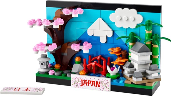
The Japan Postcard lands differently than its predecessors in this series. Where the Paris and New York entries felt like architectural highlight reels, this one commits fully to a single, cohesive mood, and that choice either elevates it or limits it depending on what you expected. The set doesn't chase iconic skylines or famous landmarks scattered across a diorama. Instead, it builds toward a moment: spring in Japan, captured through the positioning of cherry blossoms, a functioning torii gate, and Mount Fuji rendered in clever slope work that actually reads as distance and scale. Built it, and the composition reveals a designer who understood negative space.
What makes this set worth serious attention isn't novelty, it's restraint. The palette is tighter than you'd assume for Japanese scenery, the piece count modest, but the architectural decisions carry weight. The torii gate alone teaches something about how a few well-placed elements can suggest cultural context without overstatement. This isn't a set trying to pack in every recognizable image from Japan. It's one that understood what matters when you're looking at a postcard: the feeling it leaves.
The Japan Postcard arrived in 2024 as the series hit its stride - and it shows. Designer Mel Caddick made the smartest compositional choice in any of the Postcards: instead of trying to represent a single city, Japan is treated as a cultural landscape. Mount Fuji dominates the backdrop, cherry blossom trees frame the midground, and a torii gate and traditional temple occupy the foreground. The result is far more coherent as a vignette than the city-skyline format.
This set represents a maturation of the Postcard concept. The earliest entries - New York and London - took a straightforward approach: pick a city, build its skyline, frame it as a postcard. The Japan Postcard abandons that formula in favor of something more ambitious and more emotionally resonant. It's not building Tokyo or Kyoto or Osaka. It's building the feeling of Japan - the quiet contemplation of a mountain shrine, the fleeting beauty of cherry blossom season, the timeless silhouette of Fuji against a pale sky. That's a harder design brief than "build famous buildings," and LEGO's team nailed it.
At 262 pieces, the Japan Postcard sits comfortably in the middle of the series by piece count but at the very top by design ambition. Every element serves the overall composition rather than standing as an isolated landmark. The torii gate frames the viewer's eye. The cherry blossoms soften the midground. The mountain anchors the background. It's deliberate, thoughtful, and - unusually for a fifteen-dollar LEGO set - genuinely artistic. This is the Postcard that converts skeptics into collectors.
262 pieces, about 25 minutes, with a distinctly different feel from the city postcards. The mountain construction is the highlight - white-peaked slopes stacked in a proper pyramidal layering that echoes the actual architecture of the Pyramid of Giza set in miniature. The cherry blossom trees use organic-form construction (round plates, stem elements, pink 1x1 round tiles) that reads as genuinely botanical. The torii gate is a simple but elegant subassembly.
The build flow here is more meditative than the city Postcards. With New York and London, you're clicking landmarks into position one after another - bus, bridge, tower, done. The Japan Postcard builds differently. You start with the mountain, which is a slow, satisfying layer-by-layer construction. White slopes graduate into grey, grey into green at the base. Then you build the midground landscape - flat greens with gentle elevation changes - before adding the cherry blossoms and the torii gate. The experience feels less like assembling a model and more like composing a scene, which is a subtle but meaningful distinction.
The cherry blossom trees are the most satisfying individual subassembly in any Postcard set. Each tree is built from a brown stem element topped with clusters of pink 1x1 round plates arranged to suggest a canopy of blossoms. They look delicate and organic in a way that LEGO elements rarely achieve at micro-scale. When you place them into the midground of the vignette and step back to see the full composition - pink blossoms against white mountain against pale sky - there's a genuine moment of aesthetic pleasure. That's twenty-five minutes extremely well spent.
The cherry blossom construction is the transferable technique here: 1x1 round pink plates clustered on flexible stems to create an organic bloom canopy - the same fundamental approach as the Botanical Collection trees, applied at micro-scale. This is a nice introduction to organic LEGO building for any newer builder. The mountain layering also demonstrates effective use of wedge slopes for large-scale profile construction.
The mountain itself is a study in gradient construction. Starting from the white snow cap and descending through progressively darker shades - white to light grey to dark grey to green - the build teaches how to create convincing elevation and terrain using simple color progression. This technique scales beautifully to larger builds. Anyone working on a LEGO landscape diorama can apply the same principle: pick three to four colors that represent your elevation bands, and layer them from top to bottom. The Japan Postcard demonstrates this at micro-scale, but the logic works identically at any size.
The torii gate is worth studying for its efficiency. In just a handful of red pieces - two vertical bars, two horizontal crossbeams with the characteristic upward curve at the ends - the design captures the instantly recognizable silhouette of a Shinto gate. The upward curve is achieved using a single curved slope element on each side, which is a beautifully economical solution. At larger scales you'd need multiple elements to achieve that curve; at micro-scale, one piece does the job. This kind of "one piece, one feature" economy is the hallmark of great micro-scale design, and new builders can learn a lot from studying how it works here.
262 pieces with an unusually rich color palette for the Postcard series: red, white, dark red, pink, dark green, and grey for the mountain. The pink 1x1 round plates (cherry blossom) are a handy micro-scale parts haul. The torii gate red elements translate directly into any Japanese-themed MOC work. This is the most parts-diverse of the four Postcards reviewed here.
The pink elements deserve special mention. Pink is one of the harder colors to accumulate through general set purchases - it appears in Friends sets and the occasional Creator build, but rarely in the concentrations you get here. The Japan Postcard provides a focused supply of pink 1x1 round plates that are immediately useful for any botanical MOC, any cherry blossom scene, or any build that needs soft accent colors. If you're building a Japanese garden diorama at any scale, these parts are gold.
The color diversity across the full 262-piece haul is the real story. You get useful quantities of white (mountain), multiple greys (mountain and terrain), dark green (landscape), red (torii gate), dark red (temple elements), pink (blossoms), and brown (tree trunks). That's seven distinct color families in a single fifteen-dollar set. Most sets at this price point give you two or three colors at best. For MOC builders who maintain sorted parts collections, the Japan Postcard is one of the most efficient ways to add variety across multiple color bins simultaneously. Even if you never intend to display the finished build, the parts haul alone makes this a smart purchase.
The Japan Postcard is the most photogenic entry in the series. The red torii and pink blossom against the white Fuji peak creates a composition that reads as distinctly Japanese from any distance. It photographs better than it looks in the box - the spatial layering (gate foreground, blossoms midground, mountain background) creates actual depth. Displayed alone it holds its own; in a series lineup it steals attention.
The depth layering is what elevates this Postcard above its siblings. The city skyline Postcards are essentially flat compositions - buildings arranged left to right across a single plane. The Japan Postcard has genuine front-to-back depth: the torii gate sits forward, the cherry blossoms occupy the middle distance, and Mount Fuji recedes into the background. This three-layer composition creates a sense of perspective that makes the small set feel larger than it is. Your eye travels into the scene rather than simply scanning across it, and that's a fundamentally different viewing experience.
Under different lighting conditions, the Japan Postcard transforms. In warm evening light, the pink blossoms take on a golden hue and the mountain shadows deepen - it looks like a sunset scene. Under cool daylight, the whites sharpen and the composition feels crisp and morning-fresh. Under desk lamp light, the red torii gate glows. This responsiveness to ambient light is unusual for a LEGO set and speaks to how well the color palette was chosen. It's a display piece that changes subtly with the time of day, which means it never becomes invisible on your shelf the way a static model sometimes can.
262 pieces - same price, same value math. But the Japan Postcard delivers more compositional ambition per dollar than any of its series stablemates. It's the set to buy first if you're new to the series, and the one most likely to get non-LEGO people asking questions.
The value here extends beyond the standard pieces-per-dollar calculation. This is a set that punches above its price class in terms of display impact. Place it on a shelf next to sets costing three or four times as much, and it holds its own visually. The composition, the color work, the depth layering - these are design qualities you typically find in premium sets, delivered here at the entry-level price point. That disconnect between price and perceived quality is what makes the Japan Postcard feel like a steal rather than merely a good deal.
There's also an intangible value component that's harder to quantify but impossible to ignore: this is the Postcard that starts conversations. Place it on your desk at work and colleagues will ask about it. Put it on your living room shelf and guests will pick it up. Share a photo online and people will want to know what set it is. That social currency - the ability of a fifteen-dollar LEGO set to generate genuine interest from people who don't normally care about LEGO - is worth something. It makes the Japan Postcard not just a good purchase for yourself, but an effective ambassador for the entire Postcard series and for LEGO as a display hobby.
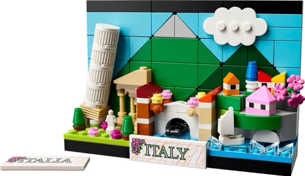
The LEGO Postcard series is a quiet triumph of product design. Launched in 2022 with New York and London, expanded in 2024 with Japan and in 2025 with Italy, the series has grown into a cohesive collection that celebrates global landmarks in an accessible, affordable format. Each entry follows the same structural template - a postcard-sized frame with micro-scale landmarks and a built-in display stand - while bringing its own distinct visual personality. The consistency of format combined with the diversity of subject matter is what makes collecting them so satisfying.
Japan's arrival in 2024 marked a turning point for the series. The earlier New York and London entries proved the concept worked - you could build a charming, displayable souvenir in under thirty minutes for around fifteen dollars. But Japan proved the concept could be elevated. By moving away from the city-skyline formula and embracing a cultural landscape composition, the Japan Postcard demonstrated that the format had room for genuine artistic ambition. It raised the ceiling for what a Postcard could be, and the Italy entry that followed benefited from that expanded design vocabulary.
As a collection, the four Postcards tell a story about world travel that resonates with almost everyone. Most adults have visited at least one of these destinations, or want to. Lining all four up on a shelf creates a personal travelogue in brick form - the places you've been, the places you dream of going. At roughly sixty dollars for the complete set, it's one of the most affordable and space-efficient LEGO collections you can build, and the visual impact of four coordinated postcards displayed together far exceeds the sum of their individual parts.
The Japan Postcard has the broadest appeal of any entry in the series, and that's largely because Japan itself occupies a unique place in the global imagination. Whether someone is drawn to Japanese culture through anime, food, architecture, history, nature, or travel, this Postcard speaks to that interest. It doesn't matter if you've visited Japan, plan to visit, or simply admire the culture from afar - the cherry blossoms, the torii gate, and Mount Fuji are universally recognized and universally appreciated symbols.
For LEGO builders specifically, this is the Postcard that demonstrates what micro-scale building can achieve when the design is strong. If you know someone who thinks small LEGO sets are "just for kids" or not worth the time, hand them the Japan Postcard. Twenty-five minutes later, they'll have a display piece on their desk that looks like it belongs in a design store. It's a conversion tool - a set that changes perceptions about what LEGO can be at an accessible price point.
The set also appeals strongly to the desk display demographic - professionals who want their workspace to reflect their personality without cluttering it. The Japan Postcard is compact, self-standing, and visually sophisticated. It reads as intentional decor rather than a toy on a desk. For remote workers who spend eight hours a day staring at their home office setup, adding a small piece of brick-built beauty to the environment is a meaningful quality-of-life upgrade. And at fifteen dollars, it costs less than a decent desk plant - with the advantage of never needing to be watered.
The natural starting point is the full series lineup: all four Postcards arranged side by side on a shelf or desk. In this configuration, the Japan Postcard should occupy a position of prominence - either at one end as a bookend or in the center as the anchor piece. Its depth and color richness make it the visual focal point of any lineup arrangement. A floating wall shelf at eye level is the ideal mounting surface, keeping the postcards visible without sacrificing desk or table space.
For a Japan-focused display, pair the Postcard with other Japanese-themed LEGO sets for a cultural vignette. The Architecture Himeji Castle is the obvious companion piece - a full-scale Japanese landmark that shares the same white-and-grey mountain palette as the Postcard's Fuji. The Botanical Collection Bonsai Tree also pairs beautifully, creating a Japanese garden theme. Even the Ninjago City Gardens, if you have the space, creates an interesting scale contrast - the massive vertical city alongside the tiny horizontal postcard, both celebrating Japanese aesthetics.
For non-LEGO integration, the Japan Postcard works exceptionally well alongside Japanese art prints, travel photographs, or decorative items. Place it on a bookshelf between Murakami novels. Set it beside a ceramic tea cup on a study desk. Prop it against a framed calligraphy print. The soft pink-and-white color palette of the Postcard complements traditional Japanese interior aesthetics, which tend toward natural materials and muted colors. This is a LEGO set that genuinely improves the look of a room when placed thoughtfully - not something you can say about every set in the catalog.
The Japan Postcard is the single best gift in the entire Postcard series, and a strong contender for the best LEGO gift under twenty dollars, period. Its appeal crosses every demographic line - age, gender, building experience, fandom. Someone who has never built a LEGO set will enjoy this. Someone who builds LEGO daily will enjoy this. A teenager obsessed with anime will enjoy this. A retiree who visited Tokyo in 1998 will enjoy this. The universal recognition of cherry blossoms, Mount Fuji, and torii gates means this set connects with almost anyone.
As a travel gift, it's unmatched. Give it before a trip to Japan as a preview of what they'll see. Give it after as a lasting souvenir that's more interesting than a refrigerator magnet. Give it to someone who watched a documentary about Japanese gardens and mentioned wanting to visit someday. The emotional resonance of this set as a gift is remarkably high for its price point. Most fifteen-dollar gifts are forgettable - a candle, a pair of socks, a gift card. The Japan Postcard is the kind of gift that stays on someone's shelf for years, and every time they see it they remember who gave it to them.
For holiday gifting specifically, the Japan Postcard fits beautifully into a stocking or a gift bag. It's compact enough to wrap easily, substantial enough to feel like a real present, and universally appealing enough that you can buy it for someone without knowing their exact LEGO preferences. If you're doing a Secret Santa exchange with a spending limit around fifteen dollars, this is one of the safest and most impressive options available. And if you want to go bigger, pairing the Japan Postcard with one or two other entries in the series creates a curated gift set that feels thoughtful and coordinated - a brick-built world tour for under fifty dollars.
- ✓ Best composition in the Postcard series
- ✓ Cherry blossom technique is genuinely beautiful
- ✓ Mount Fuji layering is architecturally satisfying
- ✓ Most photogenic display piece in the series
- ✓ Parts diverse with useful pink/red/green haul
- ✗ No minifigure
- ✗ Cultural landscape vs. city means less landmark recognition for some
Affiliate link. Some products may be provided by the manufacturer. All opinions are my own.
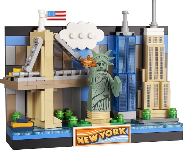
- New York Postcard Review - Another favorite in the postcard collection
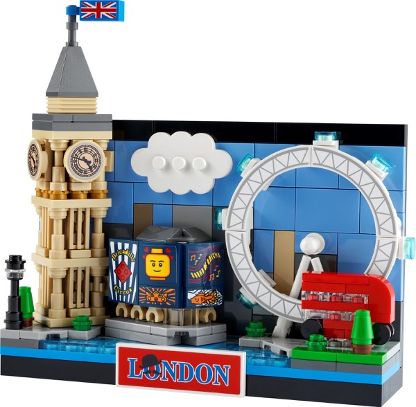
- London Postcard Review - The London entry in the postcard series
- Himeji Castle Review - A full Architecture-scale Japanese landmark
The slope work on Mount Fuji demands closer inspection than most of us give to Creator sets. LEGO employed inverted slopes and smart color blocking, primarily whites and grays, to create genuine dimensionality without the set feeling like a color study. Standing back from the finished build, the mountain actually recedes visually, which shouldn't work at this scale but does. The geometry of it proved more challenging during construction than the part count suggests, particularly in how the peak connects to the base layers without feeling disconnected.
The cherry blossom tree generates the other surprise. Rather than relying on standard pink flower elements, the designer mixed petal colors and leaf tones to create something that reads as depth and season rather than a single monolithic structure. Builders with experience in foliage-heavy MOCs will recognize why this matters, the discipline to avoid oversaturating the palette. The torii gate's function is the third payoff: it actually rotates with satisfying resistance, suggesting this wasn't an afterthought but a deliberate feature that justifies its prominence in the composition.
Track it in your vault on GameSetBrick - our free collection app. Log your condition, price paid, and watch the real-time market value.
Track in Your Vault →Save it to your wishlist on GameSetBrick. Share your list with friends and family - every set has a buy button so gift givers know exactly where to go.
Add to Wishlist →